
![]()
Illustrated icons I create each issue for the cover and some inside pages. Sometimes the text on the curves comes easily, sometimes it requires a few rounds of brainstorming with our editors on Slack.
![]()
Illustrated icons I create each issue for the cover and some inside pages. Sometimes the text on the curves comes easily, sometimes it requires a few rounds of brainstorming with our editors on Slack.
 Vans on the cover!
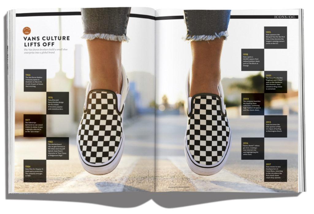 Final spread for the Vans portion of the feature, a timeline from the company’s first store in Anaheim to its sparkling new headquarters in Costa Mesa. Photographed by John Cizmas in Downtown Santa Ana.
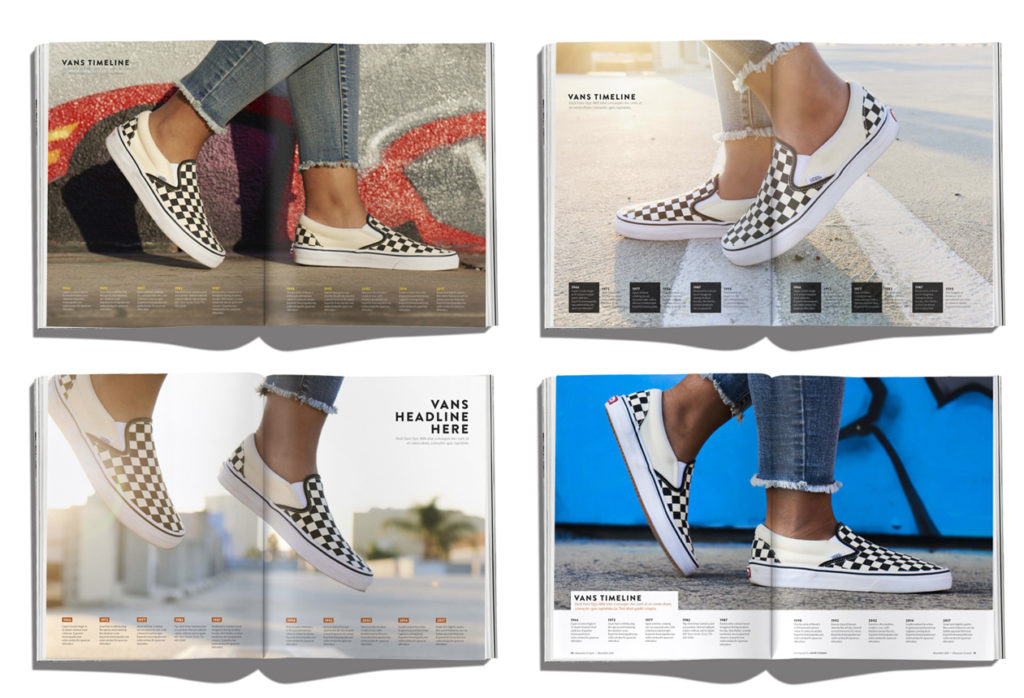 #WIP
#WIP
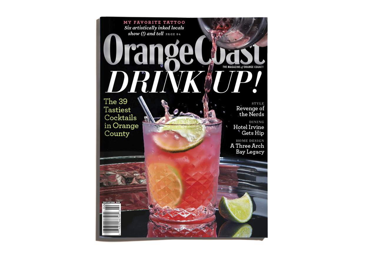
Challenge extended to the most buzzed-about bartenders in Orange County: make us a cocktail inspired by expensive baubles from local jewelers. The genesis of the idea was a cocktails and manicures photo shoot featured on So Cosmo, a manufactured reality show that ran on E! earlier this year. Photographs by John Cizmas.


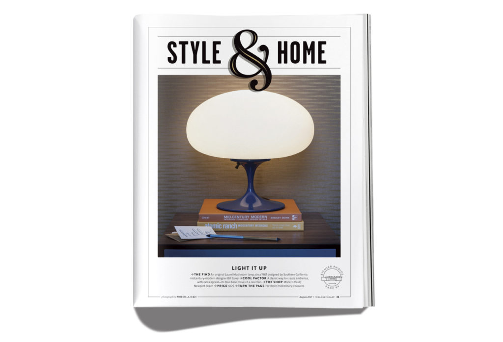
 Redesign! Introducing Brandon Grotesque as our new sans font. We’re pairing it with Mercury and a few spots of Garage Gothic. Photographed by Priscilla Iezzi at Restaurant Marin in Costa Mesa.
New section openers. Garage Gothic with a custom ampersand.


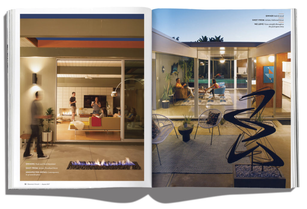
I was inspired to pitch this photo feature after moving to an Eichler home in Orange last year. See, the homes look cool from the street. But they look really spectacular when you turn on all the lights at night and photograph them from the atriums and back yards.


 Beautiful food from Mix Mix in Santa Ana, photograph by Priscilla Iezzi. Design kept simple.
 This is actually a stock photo, extended from vertical to horizontal in Photoshop. The headline is Neutra Display with a little texture and shading added. I created the banner for the deck, and the burst graphic used throughout the feature is from Creative Market.
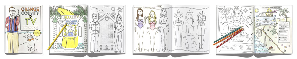
Favorite project of 2016! I commissioned Karen Cox to create coloring pages based on Orange County TV shows. It all started as a group message on Instagram by the Orange Coast art department. “Check out this Australian magazine that makes their own coloring books.” “We should make one!” “That would be so rad, O.C. coloring book.” So I started working with our production director, who sourced rough paper for just that section. Then I worked with our sales team, which sold a custom coloring page to an advertiser to cover expenses. Six months later, there it was. One of the Housewives regrammed us, so it was a social media hit. And we posted printable pages online for a contest, pulling traffic to our website. Firing on all cylinders!
 Photographed by Priscilla Iezzi at Jinny’s Pizzeria at 4th Street Market in Santa Ana. Lettering by Alex Choura.
 Illustration by Drake Brodahl. We had big plans for this one! Was supposed to be one of a series of four. Alas, the powers-that-be were skittish about permissions. Printed with a metallic touch plate.
 Photographed by Priscilla Iezzi in the studio at Orange Coast
 Photographed by Priscilla Iezzi at Kang Ho-Dong Baekjeong in Buena Park, CA.
 Photographs by Priscilla Iezzi, illustrations by Kendyll Hillegas
 Photographed by Anne Watson at 4th Street Market in Santa Ana
Photographed by Priscilla Iezzi in our associate editor’s community pool. Giselle Piña is the model.

Photographed by Priscilla Iezzi at the Balboa Beach & Tennis Club
 A feature about Jeff Sotzing, who is Johnny Carson’s nephew and also responsible for maintaining the integrity of Carson’s legacy. Photo by Kyle Monk in front of curtains sourced from IKEA and Bed, Bath & Beyond. Where the steamer fell short, the smudge tool in Photoshop took over.

Chef Roy Choi was photographed on location at The Line Hotel in Los Angeles by Kyle Monk.
 We had custom stamps created for the headline and many of the design elements. Photographs by Priscilla Iezzi.
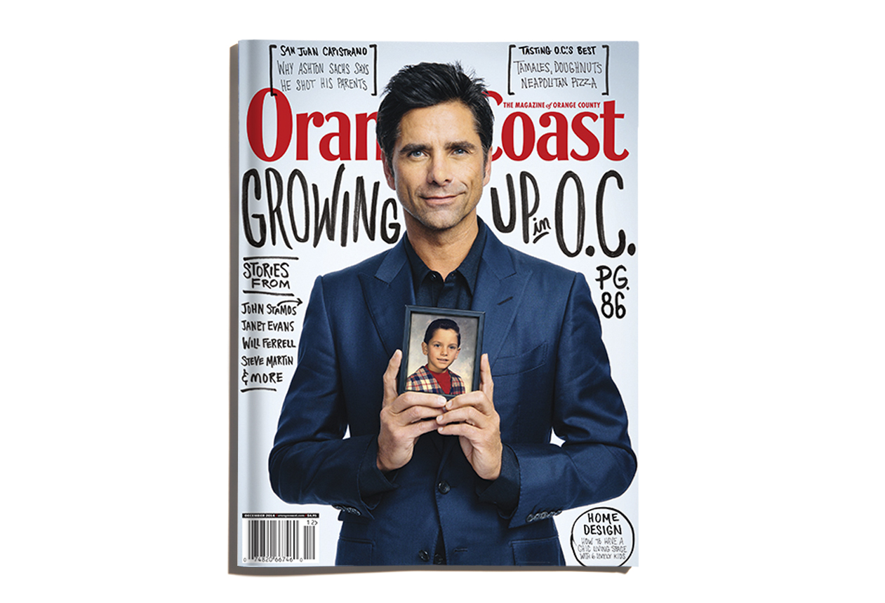
Photographed for us by David Johnson in NYC, so I was not at the shoot. Bummer! But the lettering is by yours truly.
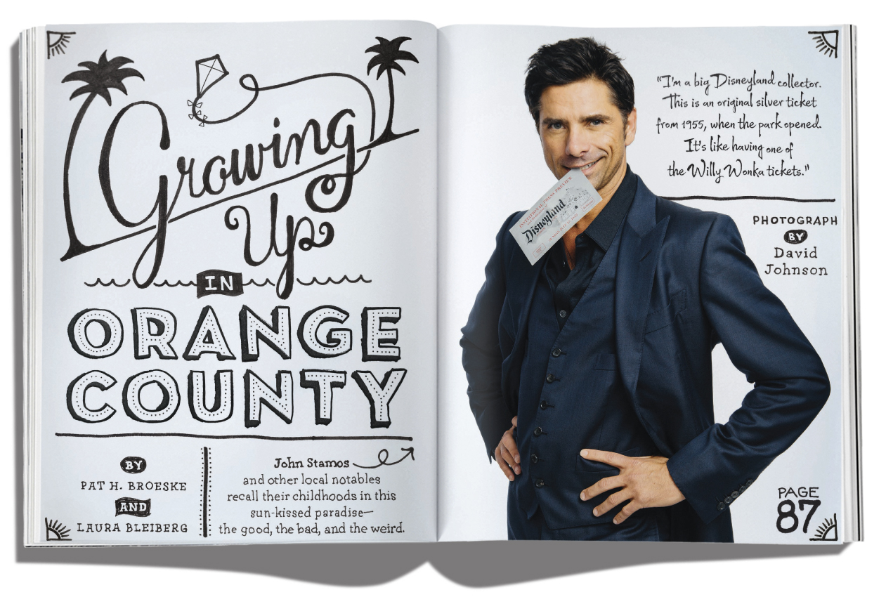
John (we’re on a first name basis, right?) has a “golden ticket” in his teeth from the the opening day of Disneyland. More lettering by me, with a little WIld Pen font in the upper left. It’s a great handwriting font with lots of glyphs for character variations.


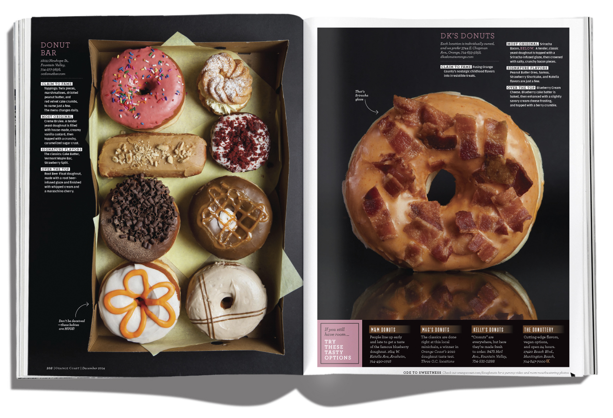 So. Many. Donuts. Yes, we sampled a lot of donuts. It’s a tough job sometimes. Photos were all shot by staff photographer Priscilla Iezzi in our studio. Great little video here.

Lettering by Lauren Hom. Photograph by Priscilla Iezzi.

Photograph by Priscilla Iezzi. Styling by Anne C. Sterling. Font is modified Studio Neon.
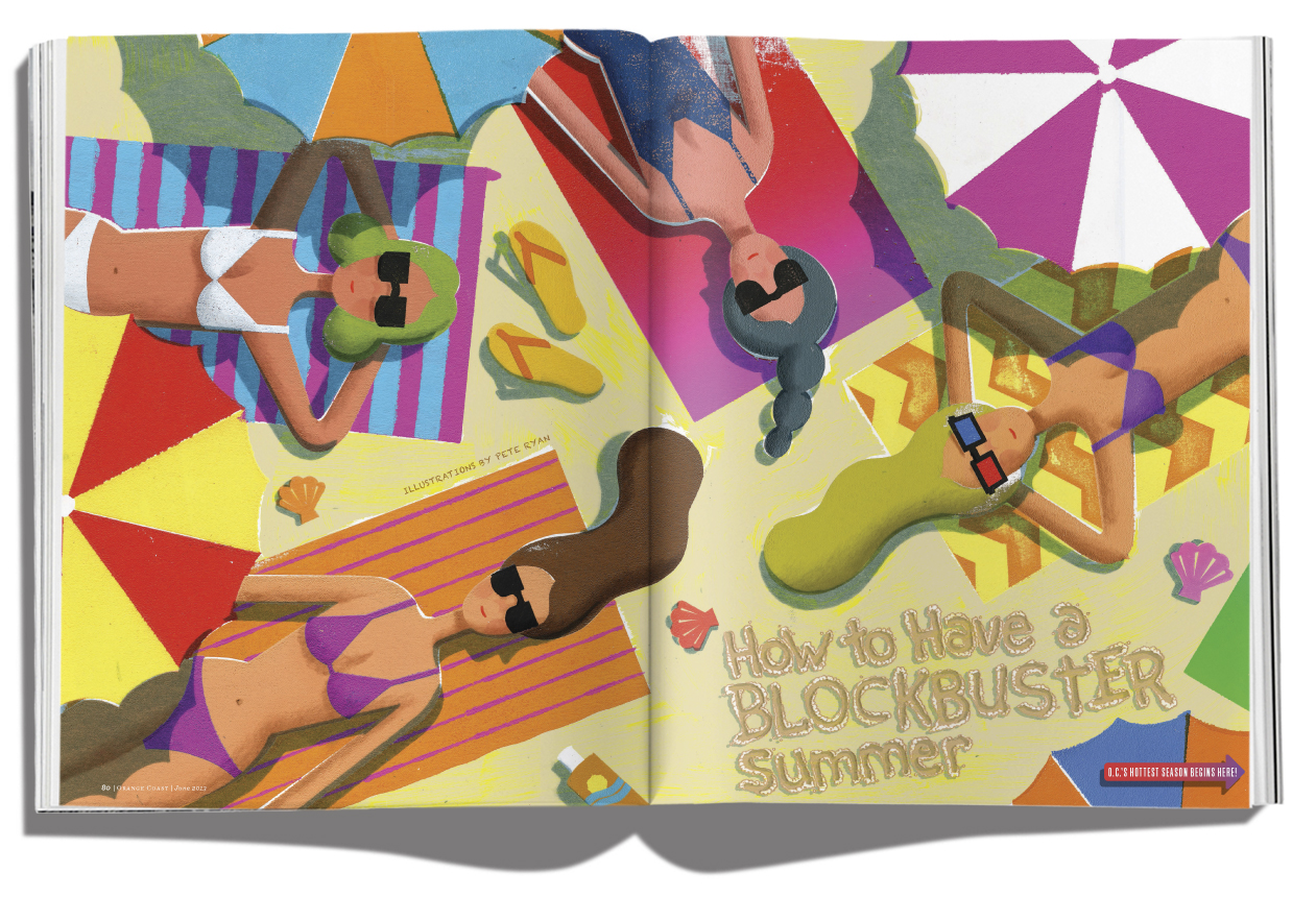 Illustrations by Pete Ryan, who always provides more awesome sketch ideas than we can possibly use.
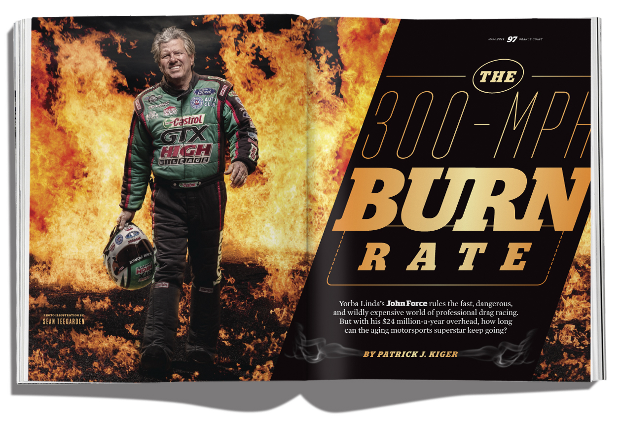
This is John Force, a drag racing legend. I actually ran into him at the airport a few days after this issue was published, so I gave him a copy. Photograph by Sean Teegarden, who always goes above and beyond.

Illustration by Anderson Design Group, who also created this travel cover for us. UPDATE: This cover received a merit award from the Society of Publication Designers. Yay!

Priscilla Iezzi took these photographs with the express purpose of pairing them with watercolor paintings I created.
 Fabulous spider web lettering created by Dan Hoopert. Illustration by Polly Becker. It was a transatlantic and transcontinental collaboration! The feature is about the writer’s chance encounter with a serial killer, not realized until decades after it happened. Read the story here — it will send shivers up your spine!
 Illustrations by Hong Yi, an artist based in Malaysia who doesn’t just play with food, she also creates wildly inventive and complicated large-scale portraits out of things like flowers and tea bags.
 Lettering by Brian Levy. Hope to work with him again soon.

Illustration by Keith Negley. Font is Ugocranis.

A playful collaboration by the artists of Backhausdance, photographer Priscilla Iezzi, and illustrator Oksana Badrak. Pinch me!
 Illustration by Jason Holley. Good stuff.
 Yummy photo by our own Priscilla Iezzi. Soho Taco Truck, in case you’re wondering.
 Illustration by the great Anita Kunz. She was so easy to work with, great concepts, turned in the final early. No idea if she was making a Zoolander reference here, but I happened to be watching it the weekend the sketch came in. I was too afraid to ask her in case it was unintentional and then she wouldn’t want to go to final with it. Type and flourishes are a customization of Reina.

Illustration by John Ueland, whom I have the pleasure of working with on a monthly basis.
 Illustration by Matt Mahurin. Kind of knocks the wind out of you. M is composed of tiny guns by our illustration intern Thinh Nguyen.
 I love how this turned out. Lettering by Kyle Miller — hope to work with him again soon.
 Gretchen Rossi in our studio, me just out of frame holding a fan.
 The things you can find on Etsy… Victoria Alvarez did a great job on the custom glasses for this guy.

Photographs by Priscilla Iezzi. This left-hand page was a cover try that was too good to toss.

Click below to see the alternate cover that didn’t make the cut — I think everyone liked the design, but the understated tone of it just didn’t work with the wording we wanted. I’m proud to say I executed the design above myself, from manipulating the type to creating the dimensional sticker look. If I had a bigger budget, I’m sure my instinct would have been to hire a lettering artist plus someone to create the sticker.

Opening photo by Ron Stoner, a great surf photographer who disappeared off the face of the Earth in the 60s. Luckily, Surfer Magazine let me run a few of his photos (Stoner was a staffer for them, so they own the rights).

I worked with UK illustrator Brett Ryder to get these illustrations. Type was sourced from the great Photo-Lettering website. Most of the photos are by Priscilla Iezzi. Aren’t they great? Those croissants were delish.

This photo was free, yes free, because some kind soul offered it up on Flickr Creative Commons. I could have sent a photographer out for something new, but sometimes you just have to be in the right place at the right time. I sourced a lot of lettering artists and vintage book covers to create this headline.

I worked with Anderson Design Group out of Nashville to create this cover. It illustrates the Lone Cypress near Pebble Beach on the central CA coast. There are lots of travel covers out there, and we wanted to create something that would stand out, that readers would want to keep on their coffee tables for awhile.

That’s right, 50 dishes! And somewhere along the way I decided that our readers would want to see photos of all 50. Who doesn’t love a good picture menu? Many thanks to Priscilla Iezzi, John Cizmas and Jessica Boone for hustling to get all the photos taken.

Yummy photograph by Priscilla Iezzi.

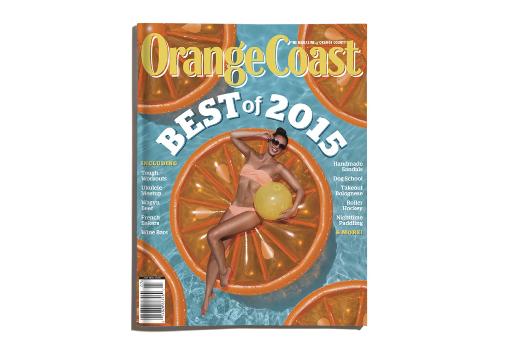
Lots of pool toys to blow up for this one! And it helps when the landscape designers are beautiful and willing to model — many thanks to John and Chris Shippy of Geoscape Design for making my job easier.

That’s my car! Isn’t it adorable? I used Metroscript by Michael Doret for the headline.

I pitched this idea and came up with a layout chock full of ideas I’d want to read about. Did you know the House Hunters people typically already own the home they’re pretending to choose? I can’t believe the OC couple was allowed to talk about it with us. UPDATE: This package was nominated for Reader Service at CRMA, a combined art/edit award. Yay!

I watched Sofia Coppola’s Marie Antoinette to get inspired for this layout. Mmm… Photographs by Kevin J. Miyazaki.

Illustrations by Catherine Lepage of Montreal. Plus, a few items written by Yours Truly. That’s right, I string a few sentences together now and then.

Some unexpected rain forced us to move this beach shoot inside. Great little illustrations by Jon Keegan. Opener photo by Jason Wallis. I used Kitti Casual by Jason Walcott for the display type.

Yep, backyard chickens have made it to OC. Great photo by Plush Studios. I created the headline treatment from a bunch of stock photo and illustration sources.
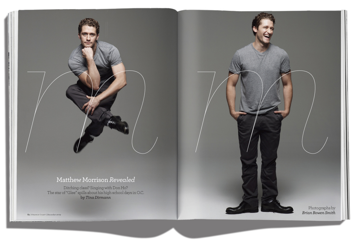
Matthew Morrison of Glee fame, photographed by Brian Bowen Smith. These shots happened when the publicist left the room for a minute and Matthew decided to have a little fun.

I was lucky that Roxy had some great photos on hand for Lisa Andersen, their big-time sponsored surfer. Headline treatment created by combining and tweaking a bunch of stock illustration elements.

Beautiful photos by Hacob in Pasadena. It took a few scouting trips to come up with just the right dish for this cover, and I’m not complaining one bit.
 Photograph by Jason Wallis. Lettering by Craig Ward. Cover model is the actress Kayla Ewell.

Find four OC-based surfers to put on a cover. Easy, right? Hah! This month I learned just how deep surf culture is in Orange County. I mean, the high schools have surf teams. So I couldn’t put just any surfers on the cover, they had to be legit. Photographed by Jason Wallis at River Jetties during a rare break in June Gloom. The little plane/banner was a last-minute tweak I added.

Not an Airstream, but a Silver Streak. This one is owned by Steve Jones of 1.7 Ocean fame. I used a combo of the typefaces Hood Ornament and Top Speed for the headline.

We channeled Condé Nast Traveler with this feature about two new resorts in SoCal. Gazillionaires only, please. Seriously, they use that Bentley to shuttle guests to their rooms. Photographs by Kevin J. Miyazaki.

Photograph by Ralph Palumbo. The owners of this house weren’t even home during this shoot, but they let us have the run of the place. I styled the model (that’s my Tarina Tarantino bracelet!) and added flowers to fill in the gaps. Those topiaries? Really just one, rotated and photographed twice. I let the model take it home. The poor pup is a shelter dog who hasn’t been adopted yet. He was left at the shelter anonymously so no one knew his name. He’s been newly christened “Riley” but didn’t respond to it no matter how enthusiastically we said it.

Photograph by James Wojcik.

I got the job! I love this layout so I wish it had been published. Alas, it’s just a test layout to prove I have what it takes for the about-to-relaunch Orange Coast. Stock photo for the opener with some fancy Photoshop manipulation on the headline type. I wasn’t happy with the pacing of some of the small bottles in the sidebars, so I researched and wrote a couple of new entries to create a better flow.

Goodbye, Las Vegas Life… I’d like to think I went out with a bang on this fashion layout. I worked with Stockholm-based illustrator Cecelia Carlstedt. Las Vegas has all the biggest names in fashion but they’re not all willing to share their product with little ol’ Las Vegas Life. What to do? Get hi-res runway shots and illustrate them in a fantasy world. I love how it turned out.
Photographs by Kevin J. Miyazaki. This was an idea I had that was so perfectly-suited for Las Vegas. It became a standing feature on the back page when we did a redesign.


I hope Milwaukeeans totally get this. There’s a new public market downtown, visible from the freeway to any commuters. There’s a big “Milwaukee Public Market” neon sign, similar to the one at Seattle’s Pike Place Market. Thing is, I didn’t have any source letters for B, S, O or F. That S was killer, I tell you! Took me about two solid days to create a believable curve and depth. I could have removed the contrail, but I kind of like it.

I sourced these twigs in my back yard. Photograph by Kevin J. Miyazaki.

Shh… Don’t tell Marshall Field’s I bought this tank top with silver paillettes and returned it after the shoot. No harm done, right?

This cover is a low-budget wonder. The Mini is borrowed from the dealership. The model is our intern. Hair done by Yours Truly. Target tank top. Map made at the office, taped together and folded. Shoot location is behind Quad/Graphics, our parent company. I love the cross-processed final result.

Posting a classic. I just love the simplicity of this. The star was sourced from a coworker’s old piano workbook — they just don’t sell stars like that anymore. I created the corner banner before the benefit of stock image websites where I could have just typed in ‘banner’ and had my pick of dozens. The file prep of this one was tricky — we wanted the star to look like a real gold star so we needed a touch plate of PMS with black laid down on top to create the ridges. Cross fingers, et voila, it printed great!

Posting a classic. Photograph by Kevin Miyazaki, main design by Sharon Nelson but thoroughly a group effort. I tried several color combos on this one until we arrived at just the right mix.


